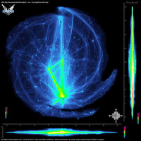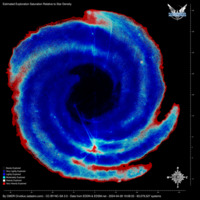

All charts and maps generated using data collected by EDSM and EDDN. All data is based on scanned bodies, and/or visited systems, so the numbers can be influenced by commander activity as much as actual distribution. The unusual patterns that emerge from some of the specific filtered maps are largely due to quirks of StellarForge, and there can be large variations between the distribution patterns of certain mass codes or certain star classes.
Maps and spreadsheets are updated once every two days in most cases. Codex maps, Graphs, and videos are updated weekly.

The heat maps are generated by tallying up all of the visisted systems that we have data for, and colorizing each pixel on the map based on how many systems have been submitted in that location relative to everywhere else on the map. Each pixel in the map represents a "column" of space. For instance, the galaxy can be almost eight thousand lightyears thick in the core, and so a pixel in that area can represent a volume of space that is 10 x 10 x 8000 lightyears. The number of systems within each pixel is then converted into a base-10 logarithm (in other words, the exponent for a power of 10), which is then used to choose a color. Because of the logarithmic color scale, a lot of detail is visible at both ends of the color scale. It loses some detail in the middle, however, because it can take a very large increase in discovery for a pixel to go from, for example, 20 discovered systems to 200 or more. For this reason, the "indexed" heat map was also created, which uses a large portion of the color scale at the low and middle range, to bring out detail that isn't visible in the logarithmic maps.
In the logarithmic heat maps, the color scales are self-calibrating. They take note of the "brightest" pixel in the map and then adjust the scale accordingly, for the best possible use of the color range. The "indexed" heat maps use a pre-defined color index.

Note: This should not be taken as "100% explored" in the red areas. It's entirely possible to still find untagged systems in areas that are heavily explored, and there are some reasons that the data can be misleading. This is just one tool that should be combined with others, in order to choose exploration destinations.
The "Exploration Saturation" map works on a similar principle to the heat maps, with each pixel representing a number of systems within that area of space. The main difference is that instead of a count of systems, the pixel represents an estimated percentage of how "complete" the exploration is in that volume of space. The calculation itself is rather simple, but there are several ways that the results can be misleading, and so this map still needs to be compared to the heat maps in order to get an idea of what is really going on.
This is similar in concept to the German Tank Problem, except that I'm just using a straight percentage division instead of the equation presented there. I may revisit this at some point.
The basic principle is to create a percentage based on the number of systems known, divided by a "guess" of how many systems should be present there. This guess is on a per-boxel basis, for each mass-code boxel that we have data on, and intersects with that pixel, using the existing systems data that we know about. (You can read more about how boxels and system names work here). Each system's name contains a number that is in a sequence belonging to that boxel. By looking at the highest number in the sequence, we can then look to see how many numbers in that sequence are accounted for in the data, or are missing instead. As a hypothetical example, let's say the highest number in a given boxel is "100". We can assume that there are at least 100 systems in that boxel in-game. There might be more, but for our purpses we can assume that this is where the boxel number sequence ends. If systems 0-99 are all accounted for, it's unlikely that someone intentionally tagged all of those and nothing higher, so we can be highly confident that this boxel is close to 100% explored. If numbers 0-99 are absent, then we know this boxel has hardly been visited. If about half of them are accounted for, then it's probably about 50% explored, and so on. We can then assign a color accordingly.
What makes this more complicated is that the boxels for different "mass codes" are different sizes, and contained within each other. So in order to get a pixel's "score", we have to compute its percentage, and then spread out its score over all of the relavant pixels, with a weight factor corresponding to how many systems it contains, and how many pixels it is spread over.
The main limitation of this is that it can only take into account boxels which have at least one discovered star system. If only a few explorers passed through an area of space, for instance, we might only know of a handful of boxels there. If those explorers mainly hit low-numbered systems (0 or 1, for instance), then those boxels will appear to be highly explored on the map. This is usually obvious and visible, because those parts of the map will look very grainy and speckled. As more explorers pass through those areas and add more data, the map will gradually smooth over those areas and darken them to a more realistic value. Anywhere that the map is less grainy, it has more complete and reliable data. The entire path between the bubble and Beagle Point, for instance, is so well traveled that it appears fairly smooth, even in the darker areas where the exploration percentage is low. In contrast, the arm gaps that are further away from this central north/south corridor are much more grainy, because the data is very sparse there, combined with the fact that those boxels tend to have few systems, and thus have low-numbered systems in the data.
The relative size of the boxels (in terms of system-count) will also limit how much of a calculation can be done. For instance, in the galactic edges, the boxels tend to only contain one or a few stars each, and so they tend to appear "completely" explored in this sort of analysis if they're present at all. Many unexplored boxels may still exist in such areas. The algorithm has no way to guess how many boxels "might" exist that don't currently exist in the data.
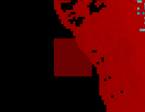
Another potential artifact, is when a large boxel (H-mass, 1280 lightyears across, for example) is calculated to be fully explored due to only having low-numbered systems in the database, but no other boxels within its area of space have any additional data to offset it. This can result in a large red area that is not accurate. In the example below, the square extends off the edge of the galaxy, and can't be countered by additional data, because there simply aren't any additional star systems off that galaxy edge. It is shown in a darker red, to indicate that there is less data to support it:

The "merged" version of this map also combines the regular heat map, with a minimum number of systems included. This is intended to give a better idea of where you are likely to run into a lot of tagged systems.